Introduction
In the age of big data, businesses have access to vast amounts of information that can provide valuable insights into their operations, customers, and market trends. However, raw data alone is often overwhelming and challenging to interpret. This is where data visualization and dashboard design come into play. By presenting data in visual formats such as charts, graphs, and interactive dashboards, businesses can unlock hidden insights, identify trends, and make informed decisions more effectively. In this article, we will explore the best practices in data visualization and dashboard design that can help businesses maximize the value of their data and drive better outcomes.
The Importance of Data Visualization
Data visualization is the graphical representation of data and information. It enables businesses to communicate complex ideas, patterns, and relationships in a clear and concise manner, making it easier for stakeholders to understand and interpret the data. Effective data visualization can help businesses:
- Identify trends and patterns: Visualizing data can reveal insights and trends that may not be apparent from raw data alone.
- Make data-driven decisions: Clear visualizations empower decision-makers to make informed choices based on data-driven insights.
- Enhance communication: Visual representations of data facilitate communication and collaboration across teams and departments, leading to more effective decision-making and problem-solving.
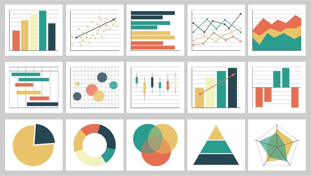
Best Practices in Data Visualization
- Choose the Right Visualization Type: Different types of data require different visualization techniques. Bar charts are suitable for comparing categories, line charts for showing trends over time, and scatter plots for examining relationships between variables. Choose the visualization type that best represents the data and makes it easy for viewers to understand.
- Simplify and Focus: Avoid cluttering your visualizations with unnecessary details. Simplify the design and focus on conveying the most important information. Remove any elements that do not add value or distract from the main message.
- Use Color Wisely: Color can enhance the visual appeal of a chart or graph, but it should be used sparingly and purposefully. Choose a color scheme that is easy on the eyes and conveys meaning effectively. Use color to highlight key data points or categories, but avoid using too many colors or overly bright hues, which can be distracting.
- Provide Context: Context is crucial for interpreting data correctly. Provide labels, titles, and annotations to help viewers understand the significance of the data and its implications. Include axes labels, units of measurement, and source information to provide context and clarity.
- Make it Interactive: Interactive visualizations allow users to explore data dynamically and uncover insights on their own. Incorporate interactive features such as filters, tooltips, and drill-down capabilities to enhance the user experience and empower users to delve deeper into the data.
Dashboard Design Best Practices
- Prioritize Information: Arrange elements on the dashboard in a logical and intuitive manner. Place the most important information prominently at the top or center of the dashboard, where it is immediately visible to users. Use layout techniques such as grouping, alignment, and spacing to organize the content effectively.
- Keep it Simple: Avoid cluttering the dashboard with unnecessary elements or too much information. Keep the design clean and minimalist, focusing on the most relevant metrics and KPIs. Use whitespace to improve readability and visual clarity.
- Provide Contextualization: Provide context and explanations for the data presented on the dashboard. Include titles, subtitles, and annotations to help users understand the significance of the metrics and their implications for business performance.
- Use Consistent Design Elements: Maintain consistency in design elements such as color, typography, and layout throughout the dashboard. Consistency enhances the user experience and makes the dashboard more visually appealing and professional.
- Ensure Accessibility: Design the dashboard with accessibility in mind to ensure that all users, including those with disabilities, can access and interact with the data effectively. Use accessible color palettes, provide alternative text for images, and ensure that the dashboard is compatible with screen readers and other assistive technologies.
Conclusion
Effective data visualization and dashboard design are essential for unlocking business insights and driving better decision-making. By following best practices in data visualization, businesses can transform raw data into clear, meaningful visual representations that reveal insights and trends. Similarly, well-designed dashboards provide stakeholders with easy access to key metrics and KPIs, enabling them to monitor performance, track progress, and make informed decisions. By incorporating these best practices into their data visualization and dashboard design efforts, businesses can maximize the value of their data and gain a competitive edge in today’s data-driven business landscape.
FAQs
Q: How can businesses ensure that their data visualizations are accessible to all users?
A: Businesses can ensure accessibility by using accessible color palettes, providing alternative text for images, ensuring compatibility with screen readers, and testing the visualizations with users of diverse abilities.
Q: What are some common mistakes to avoid when designing dashboards?
A: Common mistakes include cluttering the dashboard with unnecessary information, using overly complex visualizations, neglecting to provide context or explanations for the data, and sacrificing usability for visual appeal.
